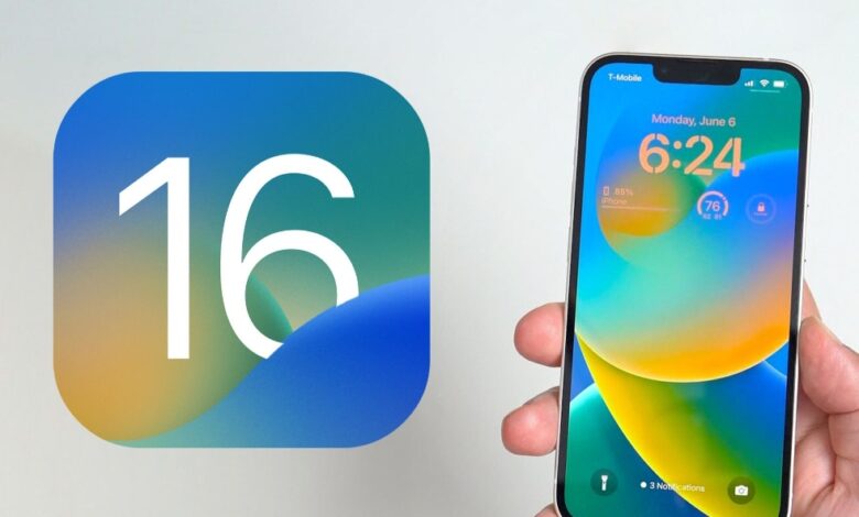
iOS 17 Fixes iOS 16’s Messy Lock Screen Customization
Compared to iOS, Android is the way to go if you want complete customizability. Nevertheless, Apple has recently allowed for more home screen customization since iOS 14.
Our favorite iPhone lock screen is the first thing we see when we pick up our phone, so iOS 16 allows us to customize it.
Despite how much I enjoy using iOS on my iPhone 14 Pro, I have always wished there were more ways to customize the software on my phone so that it feels more like home.
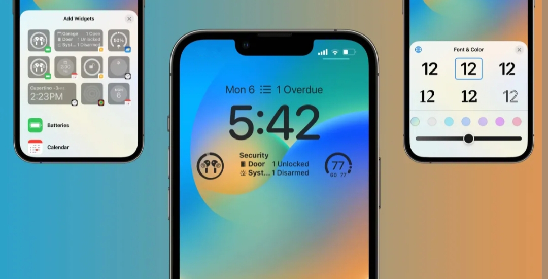
Using the Shortcuts app, iOS 14 made it possible to use custom app icons without jailbreaking. With iOS 16, you can customize the lock screen by changing the font, adding widgets, or adjusting the clock.
For the lock screen, Apple needs to do more than what we see in iOS 16. Apple should allow users to customize the lock screen in the future with iOS 17.
A Better, Simplified Interface
I first checked out the lock screen customization after watching the iOS 16 beta after WWDC22. Apple released the UI for doing so to the public without significant changes to the overall process, which I found confusing and convoluted.
I am exhausted by the user interface and experience of changing your lock screen. The lock screen must be pressed and held after unlocking it, similar to an Apple Watch.
There are multiple lock screens, too, but switching between them is more frustrating since you can’t swipe from the edge as you can on Apple Watch.
Whether you want to choose wallpaper from Apple’s collection or your photos is up to you. The newest images will always display at the top, and older images will appear down the page.
Seeing the images in reverse order needs to be clarified and throws me off since I like consistency. Apple would not change how its image picker flows. Regardless, I can only add a new lock screen if I also keep my current home screen wallpaper.
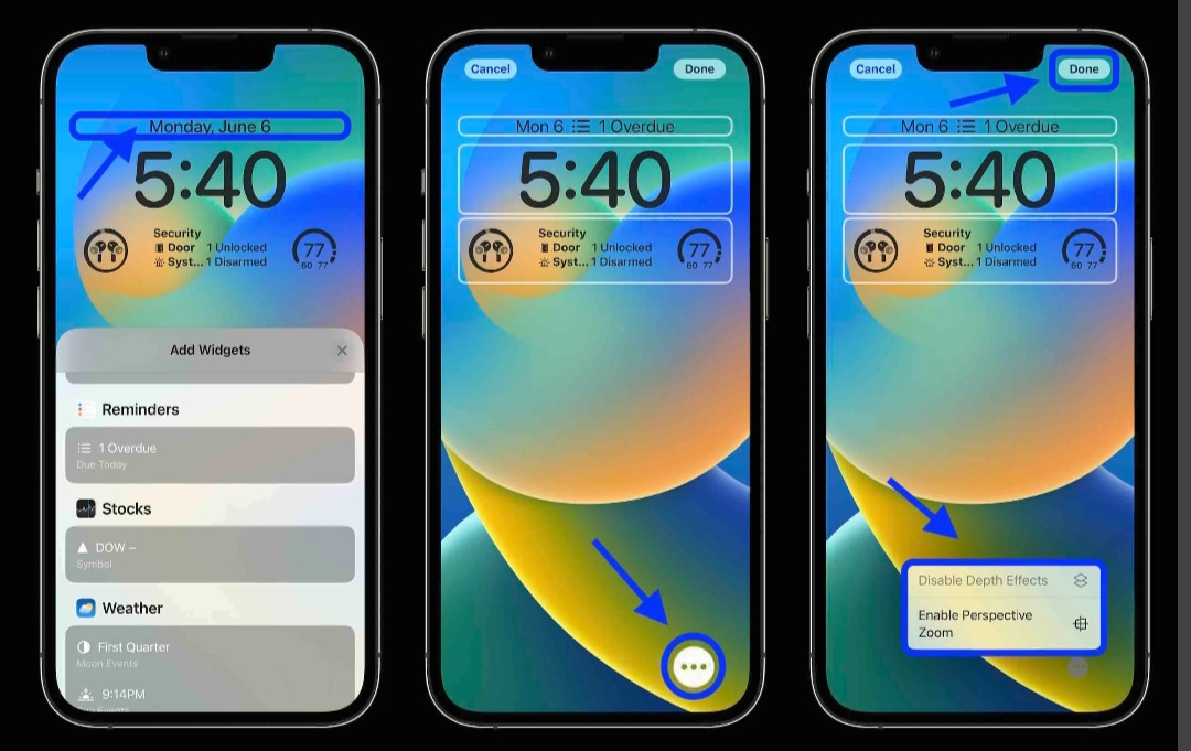
That’s the biggest issue I have. You cannot just keep your current lock screen (without having to go and find it again) after setting your new lock screen in iOS 16.
It would be best if you made it the wallpaper for both the lock and home screens, or you have to set a separate home screen image. The current user interface and experience for the lock screen on our iPhones still leaves a lot to be desired.
I’m glad Apple has given us various ways to dress up the lock screen, but the UI could be better. iOS 17 should streamline this process, especially for those who only want to change the lock screen wallpaper.
The ability to add widgets to the lock screen is one of the most significant changes in iOS 16. There is, however, almost no space for widgets on Apple’s app – only the area below the time widget (which cannot be changed).
Apple gives us a one-by-four row underneath the time, which we can fill with widgets from apps with useful widgets, provided they are available.
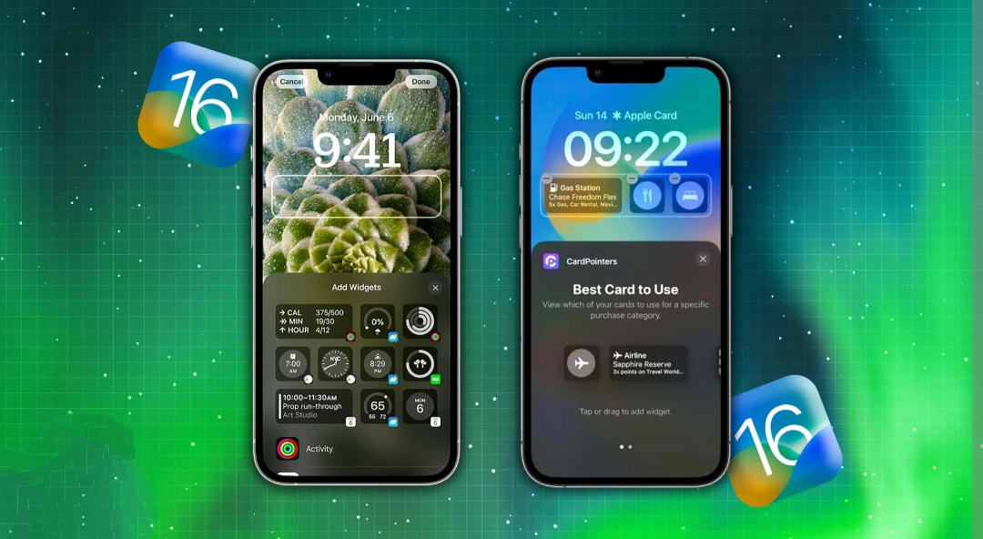
Due to the size constraint, this would mean four one-by-one squares, two two-by-two rectangles, or one rectangle and two squares. It’s possible that Apple designed it so we can still use lock screen wallpaper, but only some are into that.
Additionally, some prefer to have more information displayed on the lock screen and use simple coloured wallpapers or abstract images. For users and developers, having only a small widget space is restricting, and Apple should change it in iOS 17.
In terms of size and appearance, I prefer the size and appearance of home screen widgets. On the topic of widgets, I’d also like to see interactive lock screens (and home screens).
If, for example, a widget could control a HomeKit accessory without running an app, it would be fantastic.
Font Options
Rather than using the same typeface throughout iOS 16, Apple has added a few options to its lock screen. The Arab, Arabic Indic, and Devanagari styles come in eight different typefaces.
Unfortunately, the classic font from iOS 15 and the previous one appear to be gone. Despite the current selection, I’d like to see even more font options in iOS 17. The lock screen can’t be customized with your fonts, which surprises me.
Oddly, the lock screen doesn’t support custom fonts introduced in iOS 13. We may get more preset options with iOS 17 or an entirely new editor. They indeed look good, but they may only be suitable for some.
How can they do that if someone wants Comic Sans or Papyrus on their lock screen? Let’s give it to them, Apple! Oh, and the colors are great. In addition to the preset options, Apple lets you select the intensity of the colors according to your preferences.
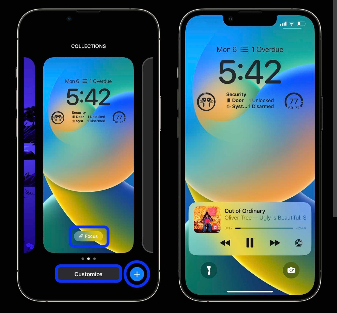
You can also change the color grid, spectrum, or sliders to create your unique color scheme. I would like to see more options for changing colors on the lock screen.
Think of a rainbow gradient or alternating between red and green for Christmas, for example. Please tell me what color I should make the numbers and which color I should make the colons.
If Apple wants to give us more options to express ourselves on the lock screen, adding more colors is a great way to do so. I’ve been looking forward to some customization of iOS for quite some time, and Apple has taken some reasonable first steps in that direction.
Apple could repeat iOS 14’s home screen customization since there have been no significant changes since iOS 14.
Still, who knows? Apple will likely surprise us with iOS 17. Improving the current lock screen process interface would be most beneficial.
Edited by Prakriti Arora


